 MegaMegaTypeType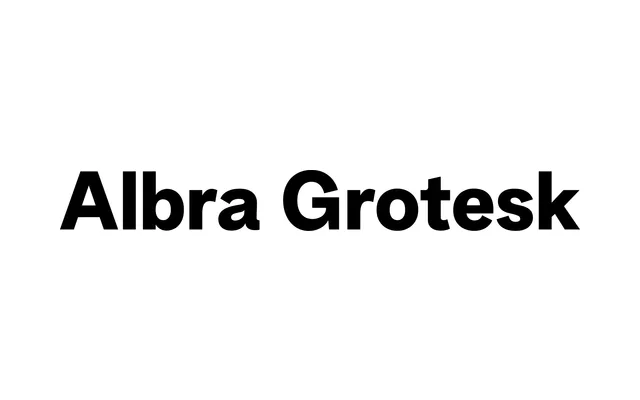
A low-contrast grotesque from Jan Weidemüller's Albra superfamily, spanning six weights with full italics and variable font support, built for editorial and luxury branding contexts.
About
Albra Grotesk is the sans companion to Rellence's Albra serif, sharing its restrained, considered aesthetic while removing stroke contrast for cleaner digital utility. Six weights from Light to Black each carry matching italics, and variable font files cover both uprights and italics. OpenType alternates – including a single-storey 'a' and a variant 'R' – give designers enough room to adjust personality without abandoning the family's neutral, refined character.
Classification
Low-contrast grotesque; neutral upright structure with open apertures; single-storey 'a' and variant 'R' alternates available; part of the Albra superfamily alongside a serif, display, text, sans and book variant; Greek and extended Latin character support