 MegaMegaTypeType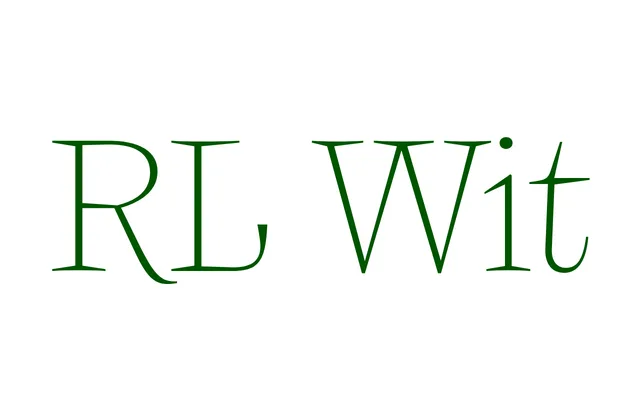
A display serif with seven weights and a variable font, rooted in late Renaissance epitaphs carved in the churches of Wrocław during the German period of the city known as Breslau.
About
The design takes cues from stone-carved Latin inscriptions produced by sculptor Gerhard Hendrik's workshop in Breslau during the late 16th and early 17th centuries, where Roman letterforms absorbed traces of the Fraktur and Schwabacher traditions used in the surrounding German texts. The family spans Hairline to Bold, with a variable font included, emphasising delicate stroke contrast appropriate to display use. Language support covers an extensive range of Latin-script languages.
Classification
A display serif drawing from late Renaissance lapidary inscriptions, the letterforms reflect the transitional influence between classical Roman proportion and medieval Fraktur/Schwabacher tradition found in carved epitaphs. Delicate stroke contrast and refined details place it firmly in the display serif category with humanist roots.