 MegaMegaTypeType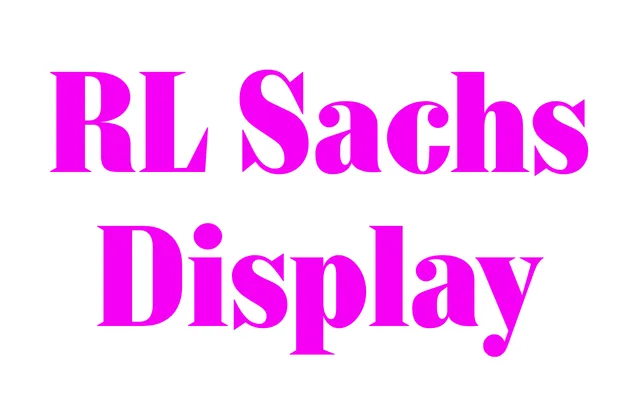
A Didone display family drawn from research into German gravestone lettering at the historic Wrocław cemetery, bridging rationalist type design with the material traces of 19th-century stonecarving.
About
Rooted in fieldwork among German-inscribed gravestones in Wrocław, the design translates a shared, workshop-derived template into a 14-style digital family with variable fonts. Characteristic features include doubled top-and-bottom terminals, strong vertical serifs paired with finer horizontal ones, and italics following a neoclassical construction. The result sits between the geometric clarity of Didot and Walbaum and the contingency of hand-cut granite letters.
Classification
High-contrast, vertical-stress Didone in the tradition of Didot, Bodoni and Walbaum, inflected by 19th-century stonecarved letterforms from Central European cemetery inscriptions. The doubled terminal treatment and strong vertical serifs distinguish it from a straightforward Didone revival.