 MegaMegaTypeType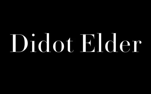
François Rappo's revival of Pierre Didot the Elder's neoclassical typeface, offered in text and display cuts with extreme stroke contrast and hairline serifs drawn with exceptional sharpness.
About
Didot Elder revives letterforms from Pierre Didot the Elder's press, a family long recognised as France's pre-eminent printer and punchcutter. The design adheres to the neoclassical model: vertical axis, pronounced thick-thin contrast and razor-thin serifs. A dedicated Display cut complements the text weights, with the family spanning Regular, Book and Bold, each with italics.
Classification
High-contrast Didone revival with exclusively vertical stress, hairline serifs and extreme thick-thin stroke contrast characteristic of the neoclassical French tradition. Drawn from Pierre Didot the Elder's original typefaces, with a dedicated Display cut alongside text weights.