 MegaMegaTypeType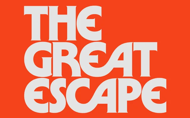
A 1970s-flavoured monoweight display face, stuffed with ligatures for custom headlines and logotypes.
About
Asoma takes its cue from the monoline display faces of the seventies and bends them into new, slightly eerie shapes. The heavy weights feel like a horror film title or a bean tin, while the Thin is calmer and more current. Piles of ligatures and stylistic sets let you rebuild almost any word into a logotype.
Classification
Monoweight display sans loosely modelled on 1970s faces such as ITC Busorama, ITC Serif Gothic and Marvin. Five weights from Thin to Heavy, a large set of discretionary ligatures and eight stylistic sets, including single-storey a, g and y.
Weights
ThinLightMediumBoldHeavy
Languages
LatinLatin Extended
Tags
displayretro1970smonolineligaturesalternatesheadlinelogotypefilm titlespackaging