 MegaMegaTypeType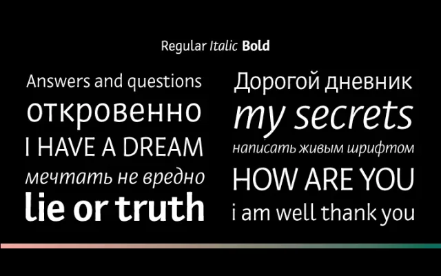
A humanist sans serif with broad-pen calligraphic roots, designed by Olga Karpushina for personal, editorial and screen contexts where warmth and informality are required.
About
Derived from Karpushina's graduate work at the Type and Typography course at the British Higher School of Art and Design, Private Sans draws on broad pen calligraphy for its underlying structure. Visible enthasis, soft terminals and a slanted axis in internal ovals give it a distinctly personal quality that is unusual among Cyrillic text faces. Three styles – Regular, Italic and Bold – make it suitable for blogs, personal web pages, memoirs, autobiographies and emotionally inflected prose.
Classification
Humanist sans serif rooted in broad pen calligraphy, with visible stroke modulation (enthasis), soft terminals and a slanted axis in internal ovals – characteristics typical of pen-derived humanist letterforms rather than geometric or grotesque construction.