 MegaMegaTypeType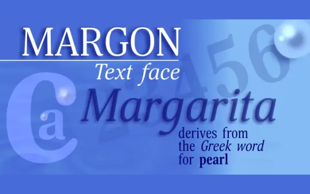
A text serif family organised into four width grades – from widest (360) to narrowest (430) – allowing precise typographic density control across editorial contexts.
About
Designed by Natalia Vasilyeva and released in 2012, Margon features small serifs, moderate stroke contrast and subtle corner roundings that keep its texture calm on the page. The four width groups (360, 380, 400, 430) differ by less than 10% between adjacent steps, enabling fine-grained selection for capacity and readability. Each group spans three weights with matching italics, making 18 styles in total, suited to books, magazines and newspapers.
Classification
A text serif with moderate contrast and small serifs, positioned between old-style and transitional conventions. Four width variants indexed by typographic density make it a systematic text family suited to editorial and publishing work.