 MegaMegaTypeType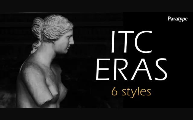
Albert Boton and Albert Hollenstein's ITC Eras is a sans-serif drawing on Greek stone-cut and Roman capital letterforms, given a slight forward slant and subtle stroke variation that lend it an informal, written quality.
About
Designed with wide curves and close letterspacing, ITC Eras opens up generous interior spaces that give the face its distinctive character. The large x-height and absence of strict geometric rigidity make it feel spontaneous rather than constructed. ParaType's 2002 Cyrillic extension, developed by Gayaneh Bagdasaryan, broadens the family's reach into Russian-language publishing.
Classification
A sans-serif with a slight forward slant and subtle stroke weight variation, drawing from both Greek lapidary and Roman capital traditions. Its spontaneous, script-like quality and large x-height place it closer to humanist sans territory than geometric or grotesque.