 MegaMegaTypeType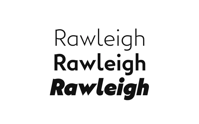
Steam-age geometry with a brushy hand, from Thin to Poster.
About
Rawleigh pairs a geometric structure with brush-inspired humanist strokes, and the specimen is all LNER railway posters. The weight axis runs unusually far, up to a Poster weight at 1000, with italics throughout.
Classification
Geometric bones with brush-inspired, humanist detail; nine weights from Thin to a Poster weight, all with italics.
Weights
ThinExtraLightLightBookMediumBoldExtraBoldBlackPoster
Optical sizes and widths
Variable: wght 100–1000, slnt 0 to -11
Family
Rawleigh VF
Languages
Latin
Tags
geometrichumanistposterheadlinevintagerailwayvariablebranding