 MegaMegaTypeType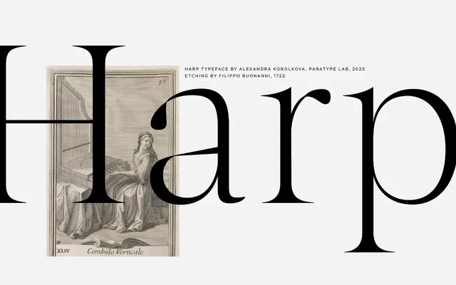
A sharp, high-contrast display serif by Alexandra Korolkova, conceived as a Platonic ideal of Times New Roman scaled for large-format use in headings, logos and posters.
About
Harp Display draws loosely on Baroque serif conventions while pushing contrast and serif sharpness toward something more idealised and extreme. It is designed specifically for large and extra-large sizes, where its letterforms remain structurally coherent even at monumental scale. Currently available as a beta with a single Thin weight; bolder styles, italics and text cuts are planned for the full release.
Classification
A contemporary display serif with sharp, high-contrast letterforms referencing Baroque serif traditions, explicitly designed for large-scale use in headings and logos rather than body text.