 MegaMegaTypeType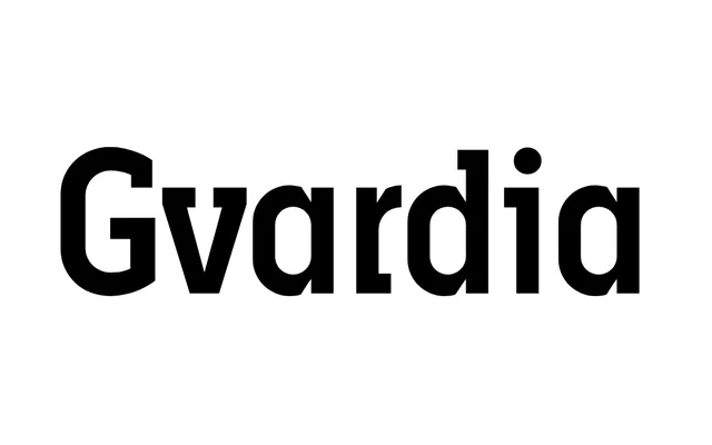
A two-weight display family with slabs that always project to the centre of the em square, designed by Oleg Karpinsky between 2000 and 2001.
About
Sharing its letterform origins with the Ariergard face, Gvardia distinguishes itself through slab serifs that consistently terminate at the centre of the em square, producing a measured, almost geometric regularity. The family comprises Medium and Heavy weights, both suited to advertising and display contexts. Alternates and discretionary ligatures extend its decorative range for poster and magazine applications.
Classification
A display typeface with slab serifs that consistently project to the centre of the em square, giving it a distinctive, experimental quality. Its relationship to the Ariergard face places it in the decorative/display tradition, intended for advertising and poster use.