 MegaMegaTypeType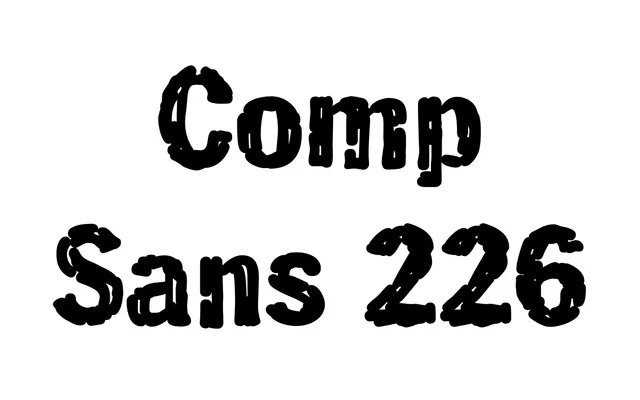
A single-weight display face mimicking the rough, hand-lettered headline style used by layout artists in the pre-digital era.
About
The letterforms carry an intentionally degraded texture with irregular edges and ink-like breaks, replicating the 'slick and quick' hand-rendering technique once used to sketch out editorial headlines. Only a Regular style is available. The design is published by TypeAssociates and distributed through ParaType.
Classification
The specimen shows a compressed, rough-textured sans-serif with heavily distressed edges and irregular ink-trap-like breaks throughout, suggesting a hand-rendered or worn quality. Classified as display due to its expressive, degraded texture unsuited to text use.
Weights
Regular
Languages
Latin
Tags
distresseddisplayhand-renderedroughcompressedretrotextured