 MegaMegaTypeType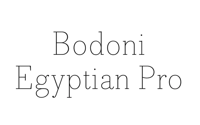
A Shinntype design that strips Bodoni's high contrast away entirely, replacing it with near-even stroke widths and monoline serifs across 14 styles from Thin to Black.
About
By removing Bodoni's defining stroke contrast and replacing it with a near-uniform line weight, the face exposes the underlying skeletal geometry of the classical model while applying it to a slab serif structure. The result sits somewhere between historical fiction and formal deconstruction, retaining a period quaintness through its proportions and serif construction. Weights range from Thin to Black, with italics accompanying most cuts from Extra Light upward.
Classification
A slab serif built on Bodoni's skeletal proportions but with near-even stroke width and monoline serifs, subverting Bodoni's characteristic high contrast to produce a hybrid that reads as both Egyptian slab and Bodoni revival.