 MegaMegaTypeType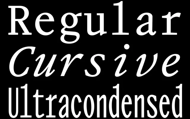
Sophie Wietlisbach's three-cut monospaced family translates Garamond's classical proportions into a fixed-width grid, with a cursive companion and a half-width Ultracondensed that radically reconceives the underlying forms.
About
Drawing on Garamond as its historical anchor, Review Mono inhabits the constraints of typewriter spacing rather than fighting them, producing text-weight cuts that carry the rhythm and character of a traditional serif. The Cursive functions as an italic surrogate, fluid enough for emphasis yet bound to the same underlying grid. The Ultracondensed is structurally precise: built at exactly half the unit width of its siblings, so two characters occupy the space of one, forcing a near-complete reconception of the letterforms at that scale.
Classification
A fixed-width family drawing on Garamond proportions and classical book typography forms, making it a monospaced serif. The typewriter classification is explicit in the foundry's own taxonomy, and the fixed-width grid is structural to all three cuts.