 MegaMegaTypeType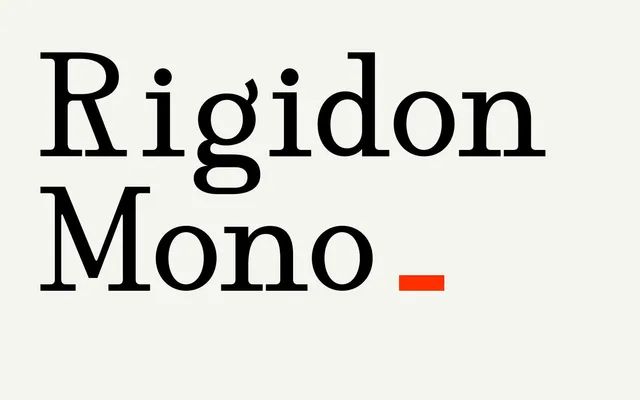
A high-contrast serif squeezed onto a monospaced grid, with a typewriter rhythm and a fashion edge.
About
Rigidon Mono pairs sharp contrast and prominent serifs with the even spacing of a typewriter face. The curved accent on the lowercase g is the most distinctive detail, and it works best in headlines, brand names and short statements.
Classification
A high-contrast serif drawn on a fixed-width grid, with rounded forms and a curled lowercase g. The monospaced spacing is its defining trait, so it sits in mono rather than serif.
Weights
Regular
Languages
Latin
Tags
monospaceserifhigh contrasteditorialfashiontypewriterheadline