 MegaMegaTypeType
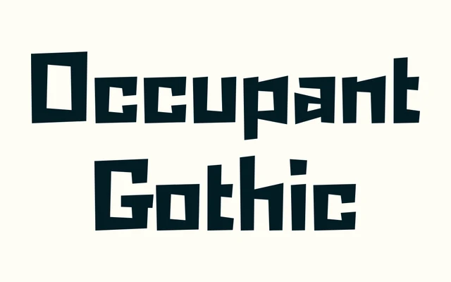
A frantic angular sans from Cyrus Highsmith, originating in his caffeinated sketchbook sessions of the late 1990s, available in two weights with italics.
About
Born from Highsmith's personal sketching style circa 1998, this typeface makes no pretence at utility and wears that proudly. The letterforms are angular and irregular in a way that reads as energetic rather than crude, carrying the idiosyncratic character of a designer's working drawings translated directly into type. Two weights, Regular and Bold, each with matching italics, make for a small but purposeful family suited to expressive display contexts.
Classification
Described by the foundry as a frantic angular design with no clear function, originating from Highsmith's caffeinated sketching style; it does not fit neatly into conventional grotesque or blackletter categories and is best placed as an expressive display face.