 MegaMegaTypeType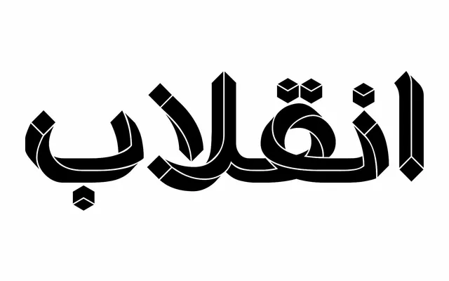
A single-weight Arabic and Persian display typeface built around deliberate visual distortion, drawing on M.C. Escher's geometric illusionism as a structural design principle.
About
Conceived in 2014 and refined over nearly a decade, Paradox applies optical distortion as an intentional aesthetic device to Arabic and Persian letterforms, creating an interlocking harmony between curved and angular strokes. The complexity of Arabic script required entirely original solutions, as existing Latin approaches to similar Escher-inspired experiments could not be adapted directly. The font was finalised for release in 2024 with technical coding support from Amin Abedi.
Classification
A display typeface designed around visual distortion as an ornamental device, combining curved and sharp forms inspired by the illusory geometry of M.C. Escher. Intended primarily for poster and headline use rather than continuous text.