 MegaMegaTypeType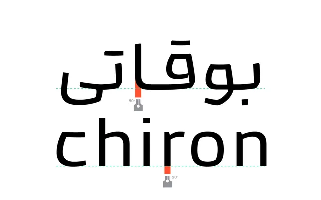
A reverse-contrast Arabic display typeface rooted in Naskh script, designed for billboard and digital advertising with seven weights and a matching Latin companion.
About
Designed by Omid Emamian and Mahdi Ershadi in 2024, Kamand inverts the conventional thick-thin stroke contrast of Naskh, placing weight where it is least expected to create a deliberately disruptive visual character. Ascenders and descenders are kept short, integrating tightly into the body to suit environmental signage and social media applications. A purpose-drawn Latin ensures harmonious bilingual composition across Persian, Arabic, Urdu and Kurdish texts, and a variable font is included in the Pro package alongside ligatures and alternates.
Classification
A reverse-contrast Arabic display typeface based on Naskh script, where the conventional thick-thin stroke relationship is inverted. Paired with a purpose-designed Latin companion, it is intended primarily for advertising and environmental signage.