 MegaMegaTypeType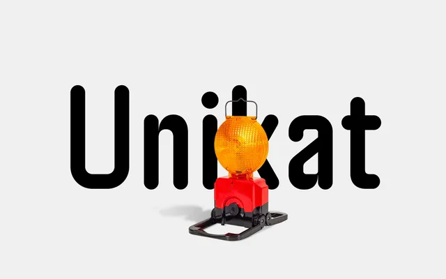
A rounded variant of neue Unikat, itself derived from Singapore Land Transit Authority signage, built on an uncompromising grid with half-circle stroke terminals and five weights across 15 styles including left- and right-leaning italics.
About
Constructed on a rigid grid with no optical compensation, the design preserves sharp inner corners while replacing all stroke endings with half-circles, producing a friendlier character than its parent without abandoning the engineer's logic underlying the family. It is a uniwidth design, meaning characters occupy the same horizontal space across all weights, making weight-switching safe in set text. Each style includes arrows calibrated to the individual weight's stroke thickness, and OpenType features extend to circle, box and directional number sets suited to wayfinding applications.
Classification
A rounded geometric sans built on a strict grid with no optical corrections, derived from Singapore Land Transit Authority signage lettering. The rounded stroke terminals soften the base design while the sharp inner corners are retained, giving it a distinctive geometric-yet-approachable character.