 MegaMegaTypeType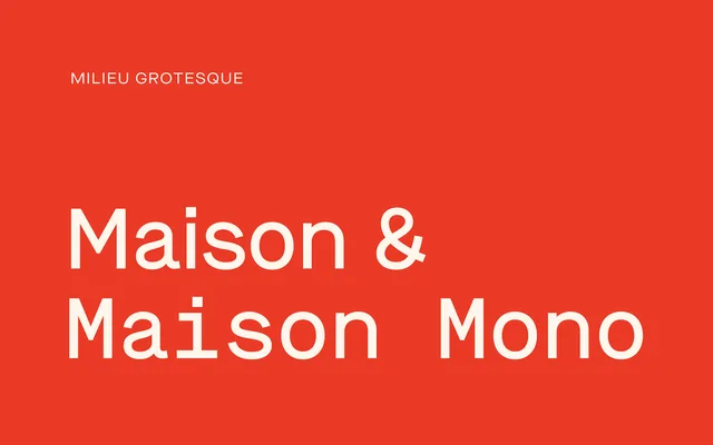
A rigid, mono-lined grotesque drawn for a Berlin architecture firm, rooted in Neue Sachlichkeit principles and built to run cleanly across proportional and monospaced alignments.
About
Maison was designed by Timo Gaessner as a corporate identity typeface for Thomas Bendel Architect, drawing its formal logic from early 20th-century constructivist grotesques. The construction is deliberately stiff: mono-lined strokes, minimal optical correction, letterforms built on a grid rather than tuned by eye. Five weights from Light to Bold are paired with matching italics and a parallel mono subfamily, making it one of the few grotesques conceived from the start to work in both proportional and fixed-width settings. Maison Neue, released two years later, softened these principles; the original holds its harder edge.
Classification
Mono-lined constructivist grotesque grounded in early 20th-century Neue Sachlichkeit principles. Drawn with deliberate geometric rigidity and minimal optical correction — a property that distinguishes it from its descendant, Maison Neue. The family runs across proportional and monospaced alignments at matching weights, making it one of the few grotesques built from the outset to serve both roles without compromise.