 MegaMegaTypeType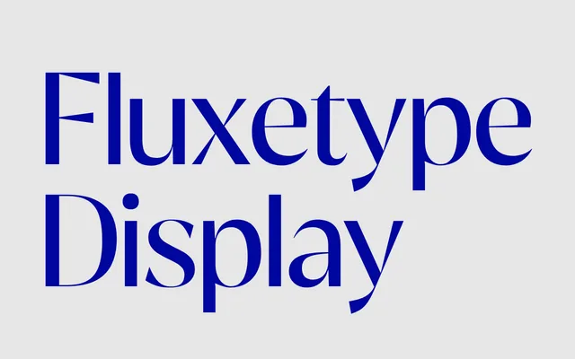
The display cut of Fluxetype, pushing stroke contrast to near-hairline thins for use at headline and poster scales.
About
Fluxetype Display sits at the top of the family's optical-size range, where maximum contrast between thick and thin strokes becomes legible rather than noisy. Seven weights from Thin to Black are offered across three optical widths (Petit, Normal, Grande), with a variable font also available. The design draws on humanist sans and serifless roman traditions, with an extensive OpenType feature set including Bulgarian and Serbian Cyrillic alternates.
Classification
Described as sitting at the intersection of humanist sans and serifless roman, with high stroke contrast that approaches hairline thins at large sizes, characteristic of optical-size display cuts.