 MegaMegaTypeType
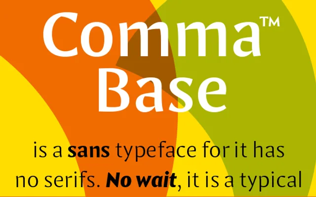
A high-contrast humanist sans that sits halfway between serif and sans, and the base of Majoor's Comma superfamily.
About
Comma Base has no serifs, but its stroke contrast and slanted, rounded endings give it the feel of a serif in text. It is uniwidth, so a word set bold takes up exactly the same space as in regular, which helps in interfaces, menus and tight layouts. Eight weights from Hairline to Ultra, with italics, cover headlines and long reading alike.
Classification
Contrasted humanist sans with no serifs but serif-like stroke contrast and slanted, rounded terminals; Majoor calls it a missing link between serif and sans. Uniwidth across all eight weights.
Weights
HairlineHairline ItalicThinThin ItalicLightLight ItalicRegularItalicMediumMedium ItalicBoldBold ItalicBlackBlack ItalicUltraUltra Italic
Languages
Latin Extended
Tags
humanistcontrastuniwidtheditorialbrandingsuperfamilydutch