 MegaMegaTypeType
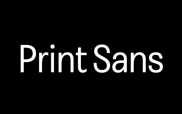
The sans of Faire Type's Print Collection, with an optical size axis that adds contrast from utilitarian text to a fine display cut.
About
Print Sans translates the contrast, proportions and rhythm of the Print serif into a clean sans, so the two pair without friction. Seven weights from Hairline to Black, each with an italic, run across an optical size axis: Print Sans is the low-contrast utility cut, Print Sans Text adds moderate contrast for long reading and Print Sans Fine pushes it furthest for display. It ships as a variable font on weight, optical size and slant, covering 93 languages.
Classification
The sans-serif member of the Print Collection, carrying Print's calligraphic contrast and proportions into a sans. Its optical size axis moves from the low-contrast Print Sans through Print Sans Text to the high-contrast Print Sans Fine.