 MegaMegaTypeType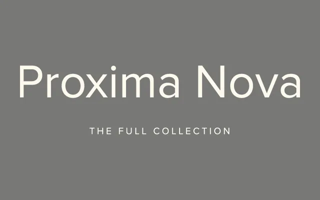
An eighty-style workhorse sans blending Futura's geometry with Akzidenz Grotesk's versatility, one of the most widely used commercial web fonts since 2010.
About
Proxima Nova grew out of Proxima Sans, a six-font family Simonson launched in 1994, reimagined a decade later with broader proportions and a cleaner geometric feel across eight weights, five widths and matching italics. Its combination of geometric bones and grotesque practicality made it one of the most licensed fonts on the web through the 2010s, and it now anchors a superfamily of script companions and stylistic siblings.
Classification
A hybrid blending Futura's geometric proportions with Akzidenz Grotesk's practicality, so it's classed as a grotesque-leaning sans rather than purely geometric.
Weights
ThinLightRegularMediumSemi BoldBoldExtra BoldBlack
Optical sizes and widths
standardExtra CondensedCondensedWideExtra Wide
Family
Proxima Nova CondensedProxima Nova Extra CondensedProxima Nova WideProxima Nova Extra WideProxima Nova ArabicProxima Nova DevanagariProxima Nova HangeulProxima Nova HebrewProxima Nova TamilProxima Nova ThaiProxima SeraProxima SoftProxima Vara
Languages
Latin ExtendedGreekCyrillicVietnamese
Tags
grotesquegeometricworkhorseubiquitouswebbranding