 MegaMegaTypeType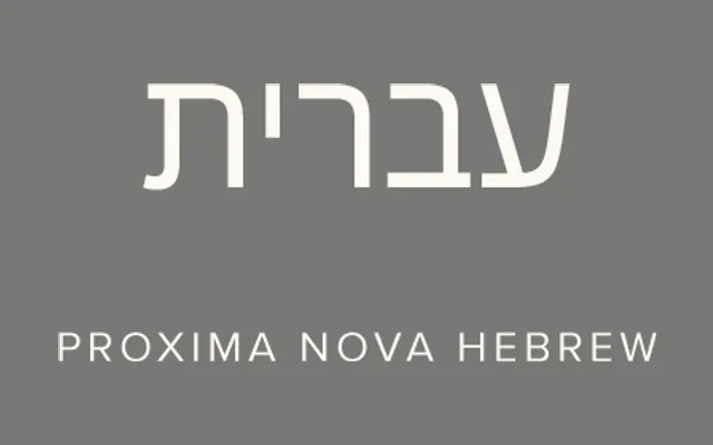
An eight-weight Hebrew companion to Proxima Nova by Letterjuice's Pilar Cano and Ferran Milan, tuned for consistent typographic colour against the Latin.
About
Proxima Nova Hebrew accounts for the fact that Hebrew letterforms are naturally more open and square than Latin ones, which would otherwise make the script look lighter without compensation. Cano and Milan balanced the design to keep Proxima Nova's personality intact while giving Hebrew text a consistent weight alongside the Latin.
Classification
A Hebrew script companion balanced against a Latin grotesque sans, classed sans-serif to match Proxima Nova.
Weights
ThinLightRegularMediumSemi BoldBoldExtra BoldBlack
Languages
Hebrew
Tags
hebrewmultiscriptcompanionsans-serif