 MegaMegaTypeType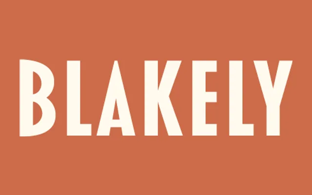
A caps-only condensed art deco sans that started life as a custom logo design for a 1990s mail-order gift catalogue.
About
Blakely began as a logo Mark Simonson drew in the early 90s for the Signals gift catalogue, later developed into a full caps-only font. It sits close to Kabel Condensed and Newport, both circa 1930, and its spacing is tuned specifically for all-caps setting. Bold and Black weights were added a few years after the original Light.
Classification
A caps-only geometric sans with condensed, near letter-spaced proportions in its lightest weight, close kin to Kabel Condensed and other 1930s deco faces.
Weights
LightBoldBlack
Languages
Latin Extended
Tags
art-decocondensedcaps-onlybrandingvintagelogotype