 MegaMegaTypeType
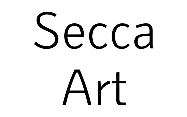
Secca with a dose of early Art Nouveau and Art Deco letterforms, fully interchangeable with the core family.
About
Secca Art swaps in the more expressive shapes of early twentieth-century grotesques while keeping Secca's metrics. You can switch a layout between Secca and Secca Art to change its tone without reflowing a line. There are no italics of its own; the foundry points you to Secca's.
Classification
Structurally the Secca sans, with selected letterforms borrowed from early Art Nouveau and Art Deco grotesques. Still a text-capable sans, not a display face.
Weights
Hairline 15Hairline 25Hairline 35ThinLightRegularBookMediumBoldExtraBoldBlack
Languages
Latin
Tags
art-nouveauart-decoexpressivetexthumanistretrobranding