 MegaMegaTypeType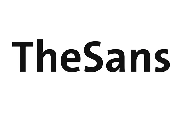
The sans-serif anchor of the Thesis superfamily, an eight-weight workhorse built for corporate and editorial systems with real italics throughout.
About
TheSans is the sans half of Luc(as) de Groot's Thesis system, first published in 1994 and still one of the most widely licensed European typefaces. Eight weights run from a hairline hint through to Black across three widths, each with genuinely drawn italics rather than sloped romans. Later OpenType updates pushed language support out to Cyrillic, Greek and Arabic, which is why it turns up everywhere from annual reports to airline signage.
Classification
TheSans blends grotesque neutrality with humanist proportions across an eight-weight ladder built for corporate and editorial use, the sans anchor of de Groot's 1994 Thesis superfamily.