 MegaMegaTypeType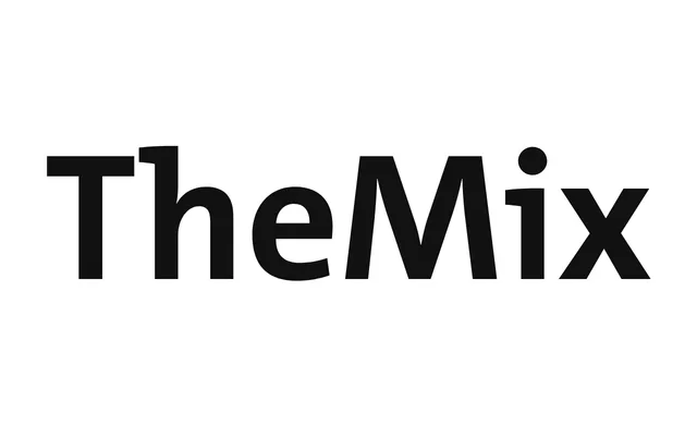
A low-contrast, pen-inflected sans that completes the Thesis trio alongside TheSans and TheSerif.
About
TheMix keeps the diagonal stress of broad-nib handwriting inside otherwise sans letterforms, giving it a warmer rhythm than TheSans at the same weight. It shares the Thesis system's eight weights and three widths, so it slots into the same corporate identity kits as its siblings.
Classification
TheMix has no serifs but keeps a broad-nib calligraphic stress and diagonal flow, which the foundry itself labels semi-serif rather than a plain grotesque.
Weights
ExtraLightLightSemiLightPlainSemiBoldBoldExtraBoldBlack
Optical sizes and widths
NormalSemiCondensedCondensed
Family
Languages
Latin ExtendedCyrillicCyrillic ExtendedGreekArabic
Tags
humanist sanscalligraphiccorporateeditorialmultiscript