 MegaMegaTypeType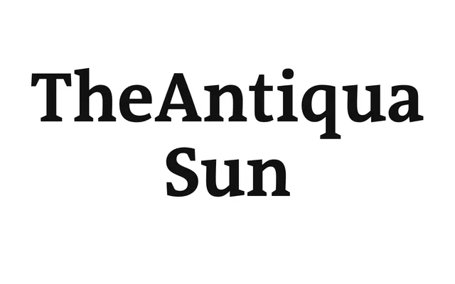
A stripped-back, two-weight corporate serif built as a bespoke variant of TheAntiqua for Sun Microsystems.
About
TheAntiqua Sun trims the wider family down to Regular and Bold, sharpening the details and simplifying the structure for a corporate brief. It began as client work for Sun Microsystems and now sits in the catalogue as its own product.
Classification
A two-weight corporate cut of TheAntiqua made for Sun Microsystems, simplified and sharpened compared with the main family.
Weights
RegularBold
Family
Languages
Latin ExtendedCyrillic
Tags
old-style serifcorporatebranding