 MegaMegaTypeType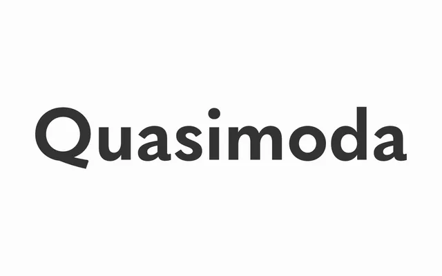
An 11-weight sans-serif family that mixes geometric construction with classical grotesque proportions and a small x-height suited to body text and display work alike.
About
The family spans Hairline through Heavy, with matching italics throughout, and is designed so that lighter weights read as crisp and modern while heavier weights carry a deliberately antiquated quality. Long descenders and a small x-height make it a natural companion to Renaissance serifs such as Garamond, and it handles extended body copy as comfortably as headline and branding contexts. Language support covers over 80 Latin-script languages plus Bulgarian Cyrillic.
Classification
Quasimoda blends geometric forms with classical grotesque proportions, placing it between a pure geometric sans and a 19th-century grotesque. The small x-height, long descenders and weight-dependent character shifts reinforce its hybrid grotesque-geometric identity.