 MegaMegaTypeType
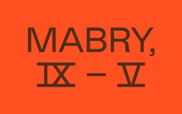
Originally designed in 2014 for apparel brand Nasty Gal, Mabry blends late 19th-century grotesque forms with early 20th-century geometric rationalism across five weights with matching italics.
About
Conceived as NG Grotesque for Los Angeles label Nasty Gal, the commercial release takes its name from funk singer Betty Davis (born Betty Mabry). The design draws on sources as distinct as Schelter & Giesecke's Breite (1890) and Renner's Futura (1927), occupying the contested ground between their respective logics. The result is a 14-style family that can appear candidly blunt in one context and sensitively drawn in another.
Classification
Mabry sits between late 19th-century grotesque traditions and early 20th-century geometric sans-serif rationalism, blending idiosyncratic grotesque forms with geometric construction principles in a way that resists clean classification into either camp.