 MegaMegaTypeType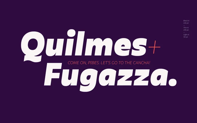
A high-contrast sans-serif in 10 weights with matching italics, inspired by Antique Olive but shaped towards a more contemporary, expressive character.
About
Olivetta's defining feature is the pronounced contrast between thick and thin strokes across the lowercase, which intensifies as weights increase towards the heavier Black. The lighter weights suit refined headline work, while the heavier cuts perform well in posters, branding and editorial contexts; intermediate weights are usable for extended reading. Each of the 20 styles contains over 400 glyphs, including alternates.
Classification
A high-contrast sans-serif with strong thick-to-thin stroke variation across the lowercase, referencing the Antique Olive tradition while leaning into a more contemporary, expressive sensibility. The pronounced contrast and stroke modulation push it toward humanist sans territory rather than pure grotesque.