 MegaMegaTypeType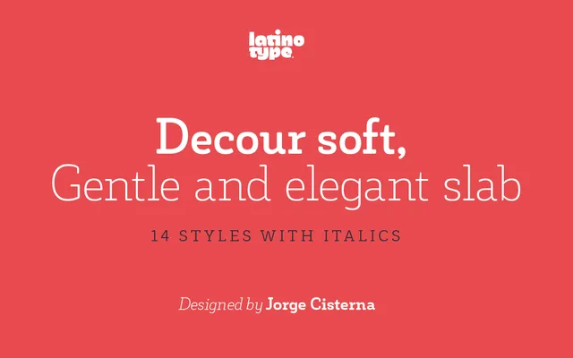
A rounded humanist slab serif with Art Deco origins, offered in seven weights with matching italics for use in logotypes, packaging and editorial subheadings.
About
Decour Soft is the rounded-terminal variant of Jorge Cisterna's Decour, softening its slab construction while preserving low stroke contrast and strong curves that give the face an approachable character. The Art Deco heritage shows in a notable size contrast between upper and lower case letters, lending a quiet elegance. Fourteen styles across seven weights make it practical for both display applications and shorter editorial text.
Classification
A humanist slab serif with rounded terminals, low stroke contrast and Art Deco proportional influence. The soft edges distinguish it from the parent Decour while retaining slab construction and a marked size contrast between upper and lower case.