 MegaMegaTypeType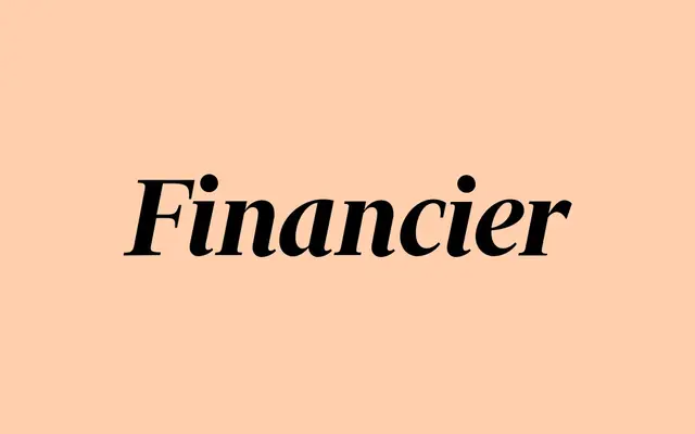
A high-contrast editorial serif drawn for the Financial Times in 2014, Financier Display takes its authority from Eric Gill's Perpetua across six weights from Light to Black.
About
Designed by Kris Sowersby and commissioned for the Financial Times' 2014 redesign, Financier Display draws its formal character from Eric Gill's Perpetua: sharp joins, flat unbracketed serifs and carefully crafted numerals that hold up in data-heavy layouts. Six weights spanning Light to Black, each with a matching italic, give it genuine range across headlines, pull quotes and financial tables. A variable font covering the full 300–900 weight axis ships with the full family purchase.
Classification
High-contrast serif commissioned for the Financial Times. Display cut draws from Eric Gill's Perpetua – stately caps, sharp joins, flat unbracketed serifs without ink traps. Italics reconcile mechanical sloped Romans with calligraphic tradition. Numerals receive special treatment reflecting Gill's flat-top 3s and three-quarter-height 2s, suited to data-heavy editorial contexts. A companion Text cut (separate retail product) draws more from Gill's Solus and Joanna for body-copy use.