 MegaMegaTypeType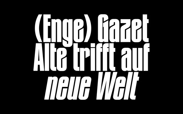
A bold display serif from New Letters with a name evoking newspaper tradition and a single weighty cut suited to editorial headlines.
About
Gazet presents a single bold weight, suggesting it is conceived as a headline or display face rather than a text workhorse. Its name references the gazette tradition, implying editorial roots. The page offers minimal technical detail, but the serif classification and bold-only offering point to a punchy, high-impact design.
Classification
Classified as a display serif based on the bold weight and editorial serif character suggested by the page content. The name 'Gazet' evokes newspaper heritage, typical of high-contrast display serif designs.
Weights
Bold
Languages
Latin
Tags
serifbolddisplayeditorialnewspaperhigh-contrast