 MegaMegaTypeType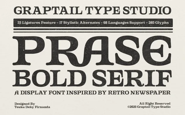
A single-weight bold display serif drawn from 1980s and 1990s newspaper lettering, with 33 ligatures and 17 stylistic alternates for headline and title work.
About
Compact letterforms and a slightly textured quality recall the dense, ink-heavy type of vintage broadsheet printing. The extensive OpenType feature set, including discretionary ligatures, stylistic alternates and ordinals, gives designers room to vary texture and rhythm across large-scale editorial layouts. Sold as a single bold cut, it is best suited to display use rather than running text.
Classification
A bold display serif with a compact, textured quality evoking newspaper print from the 1980s and 1990s, placing it firmly in the display serif category with a retro editorial character.
Weights
Bold
Languages
Latin
Tags
serifdisplayretrovintageeditorialnewspaperboldheadline