 MegaMegaTypeType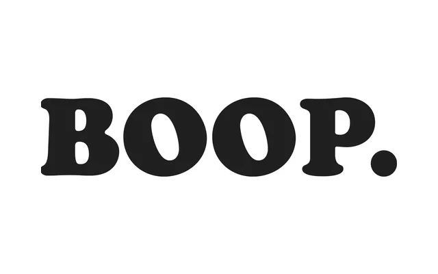
Oswald Cooper's 1919 display serif, best known in its Black weight, defined an era of commercial lettering with its exaggerated rounded serifs, low stroke contrast and distinctly calligraphic character.
About
Cooper Black's buoyant, inflated letterforms owe their endurance to a careful balance of legibility and personality: back-slanted counters, bulging serifs that dip below the baseline, a low x-height and a double-storey 'g' that demonstrates Cooper's considerable skill as a calligrapher. Its low thick-to-thin contrast gives it a casual, slouching quality that sets it apart from more formal ultra-bold designs such as Fat Faces. Used on album covers, food packaging and novelty signage alike, it remains one of the most recognisable typefaces of the twentieth century.
Classification
A heavily weighted display serif with exaggerated rounded serifs, low stroke contrast and an obvious calligraphic heritage. Its inflated, softened letterforms place it firmly in the display serif tradition, closer to rounded old-style than fat face.