 MegaMegaTypeType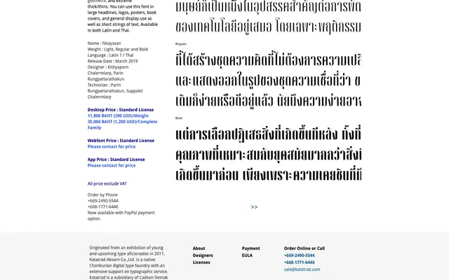
A high-contrast condensed display typeface with extreme thick/thin strokes, available in Latin and Thai for headline and poster use.
About
Nitayasan takes its name from the Thai word for magazine (นิตยสาร), reflecting its intended use in editorial and display contexts. The geometric construction and extreme stroke contrast make it suited to large-scale applications such as headlines, book covers and posters. Three weights – Light, Regular and Bold – are offered across both Latin and Thai scripts.
Classification
Classified as display due to its extreme thick/thin contrast and condensed proportions, which are designed primarily for large-scale headline and poster use rather than continuous reading.
Weights
LightRegularBold
Languages
LatinThai
Tags
displaycondensedhigh-contrastgeometricthaibilingualheadlineposter