 MegaMegaTypeType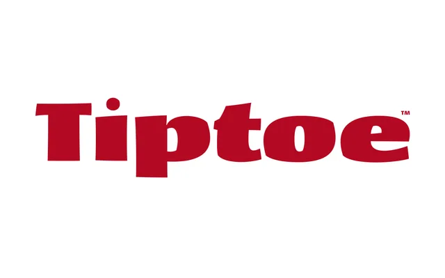
An unapologetically heavy display face for headlines, cards and titles, named a Typographica favourite in 2006.
About
Tiptoe makes no apology for its weight: four cuts running Bold to UltraBlack, with rounded feet at the baseline giving it the sturdy stance its name implies. Alternate J and Q forms and an uncial E keep all-caps settings from feeling stiff.
Classification
An intentionally heavy, foot-footed display face built for headlines and short-form messaging rather than text, with weights running from Bold to UltraBlack.
Weights
BoldExtraBoldBlackUltraBlack
Family
Languages
Latin
Tags
displayultra-boldheadlinesgreeting cardsaward-winning