 MegaMegaTypeType
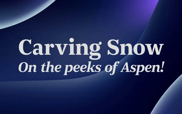
A sturdy display serif in five weights with italics, named after Portugal's Douro valley and companion to JT Douro Sans.
About
JT Douro Serif has firm, wedge-like serifs and a generous x-height that keep it solid at headline sizes. The heavier weights have real presence, while the italic adds movement. It pairs with JT Douro Sans for a matched system.
Classification
Wedge-like bracketed serifs, a large x-height and moderate contrast give it a sturdy, contemporary display character, with a lively italic that keeps it from feeling bookish.
Weights
LightRegularMediumBoldBlack
Languages
LatinLatin Extended
Tags
serifdisplayeditorialheadlinebrandingcontemporarywarm