 MegaMegaTypeType
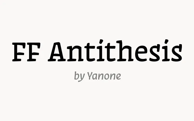
A compact three-style serif by Yanone from 2013, with slab-leaning serifs and small caps.
About
FF Antithesis is a small, focused family: Regular, Italic and Bold with a full OpenType kit of small caps, fractions and figure styles. Its firm serifs read well on screen and give logos and packaging a sturdy, characterful voice.
Classification
Three-style serif (Regular, Italic and Bold) drawn by Yanone in 2013, with slab-leaning serifs and an OpenType set that includes small caps and full figure options.
Weights
RegularBold
Languages
Latin
Tags
serifslabcontemporarybrandingwebheadline