 MegaMegaTypeType
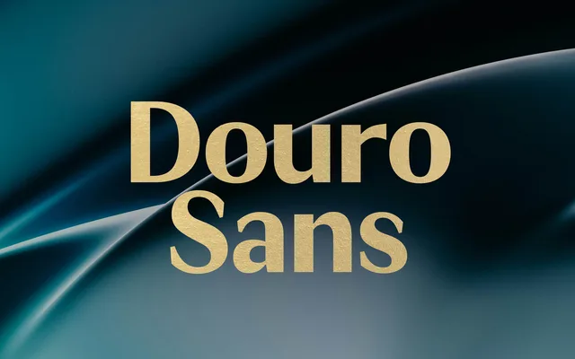
A flared, deco-tinged sans in five weights with italics and plenty of ligatures, for posters and magazine work.
About
JT Douro Sans has subtly flaring strokes and modulated contrast that give it an elegant, glyphic feel. Over 500 glyphs include ligature sets and alternates for more decorative settings. It shares its name and region with JT Douro Serif.
Classification
Strokes swell slightly towards the terminals and the contrast is modulated, in the flared, glyphic manner of Optima rather than a monoline sans. The art deco references show in its proportions and alternates.
Weights
LightRegularMediumBoldBlack
Languages
LatinLatin Extended
Tags
flaredsans-serifart decoelegantdisplaypostereditorialligatures