 MegaMegaTypeType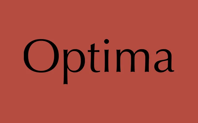
Hermann Zapf's humanist sans with flared terminals and modulated stroke contrast, drawing on classical Roman inscriptional letterforms.
About
Optima occupies an unusual position in type history, sitting between a serifed and unserifed design through its subtly flared stroke endings and visible weight contrast. Inspired by inscriptions Zapf observed in Florence, the typeface carries a calligraphic warmth absent from most sans-serifs. Its legibility and elegance have made it one of the most enduring faces of the twentieth century.
Classification
Optima is a humanist sans-serif with visible stroke contrast, derived from classical Roman letterforms. Its flared terminals and modulated strokes place it between a serifed and unserified design, firmly in the humanist sans tradition.