 MegaMegaTypeType
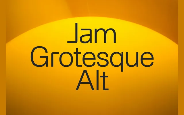
A squarer variant of Jam Grotesque in seven weights with italics and Cyrillic, for branding, editorial and screen work.
About
Jam Grotesque Alt keeps Jam Grotesque's Helvetica-like frame and squares it off: the a and m have flatter, squarer curves and the J sits on a flat bar. Those few changes make it read slightly more technical than the original. The weights and italics match, so the two can share a page.
Classification
Built on Jam Grotesque's neo-grotesque skeleton, with horizontal terminals and closed apertures, but with squarer curves and a J that ends in a flat foot. The squared details push it a little towards the mechanical end of the genre.
Weights
ExtraLightLightRegularMediumBoldExtraBoldBlack
Languages
LatinLatin ExtendedCyrillic
Tags
neo-grotesquegrotesquesans-serifneutralbrandingeditorialuicontemporary