 MegaMegaTypeType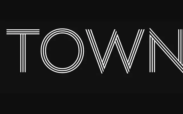
An Art Deco-inspired display superfamily spanning 12 sub-families and 114 styles, built for layering and well-suited to hospitality, food and bespoke brand identities.
About
Designed by Jason Vandenberg, Town draws from Art Deco lettering traditions and scales from text weights with full italics through to dimensional, inline, shadow and stencil variants designed to be layered on top of one another. The 12 sub-families share compatible proportions, making it straightforward to combine styles within a single composition. At 114 styles in total, it covers signage, menus, packaging and editorial work within one cohesive system.
Classification
Art Deco-inspired geometric sans-serif superfamily with 12 sub-families covering text, display, chic, contrast, dimensional, inline, lines, shadow, stencil, emboss, and two accent families. Town Text is the only sub-family with italics. Dimensional, Inline, Shadow and Lines sub-families are designed for layering on top of one another. No condensed or extended width variants.