 MegaMegaTypeType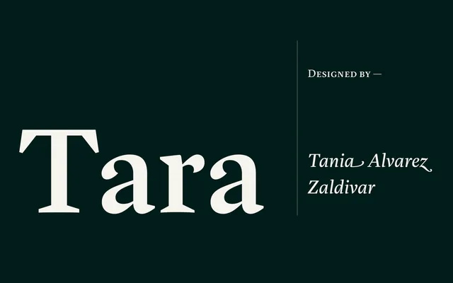
A high-contrast serif designed for extended reading, with wedge serifs, near-vertical stress, calligraphic details and swash alternates across four weights with matching italics.
About
Designed by Tania Alvarez Zaldivar, a graduate of the Type & Media programme at KABK in The Hague, Tara pairs a tall x-height with oldstyle-inflected letterforms, retaining calligraphic traces in the lowercase 'a' terminal and 'g' ear. The italics include several dozen swash alternates suited to headline and logo use, while the family also provides small caps, 14 f-ligatures, proportional oldstyle figures and a full set of numerators and denominators. Extended Latin coverage makes it a practical choice for multilingual editorial and publishing work.
Classification
High-contrast letterforms with near-vertical stress axis and wedge-shaped serifs place Tara in the transitional tradition, though calligraphic traces in the lowercase and oldstyle figure defaults signal oldstyle influences throughout.