 MegaMegaTypeType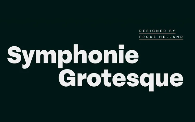
A Norwegian-designed neo-grotesque in five weights with genuinely cursive italics that swap double-storey forms for single-storey alternates, setting it apart from the slanted-upright convention.
About
Frode Helland's Symphonie Grotesk follows neo-grotesque conventions in the uprights – double-storey 'a', single-storey 'g', tabular lining figures – but breaks from genre habit in the italics, where the 'a' becomes single-storey and 'f' and 'ß' acquire descending tails. The 'M' retains visibly raised middle diagonals across all styles, and ascenders sit noticeably above the cap height while capitals and numerals share the same height. The ten-style family is well suited to branding, corporate identity and editorial work.
Classification
A neo-grotesque sans with the upright neutrality typical of the genre, distinguished by genuinely cursive italic alternates rather than slanted uprights – single-storey 'a', descending 'f' and 'ß' in italics.