 MegaMegaTypeType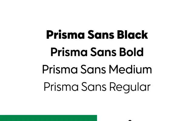
A custom typeface designed for the Finnish hypermarket chain Prisma, balancing brand familiarity with a more refined typographic execution.
About
Commissioned through creative agency Aivan for SOK, the parent company of Prisma's 77-location Finnish retail chain, the typeface was designed to preserve the established brand voice while sharpening its typographic quality. The brief centred on continuity rather than reinvention, updating an existing visual identity without disrupting customer recognition. Niklas Ekholm and Juho Hiilivirta of Helsinki Type Studio led the type design.
Classification
Based on the retail branding context and the studio's described goal of a familiar yet refined look, this is a humanist sans likely rooted in existing Finnish retail identity conventions. The 'refined familiarity' brief points to a legible, approachable typeface suited to signage and commerce.