 MegaMegaTypeType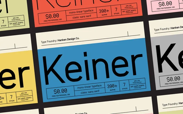
A rigid mono-linear geometric sans with minimal optical corrections, suited to signage, logotypes and display use.
About
Keiner eschews conventional optical corrections and stroke contrast in favour of a uniform, mechanical rigidity that works well at large sizes. Its versatility extends from environmental signage and logotypes to headlines and, to a degree, body text. The full version is offered free for personal use.
Classification
A mono-linear geometric sans with minimal optical corrections and near-zero stroke contrast, giving it a rigid, mechanical character typical of geometric grotesque display faces.
Weights
Regular
Languages
Latin
Tags
geometricmonolinedisplaysignagerigidmechanicalgrotesquelogo